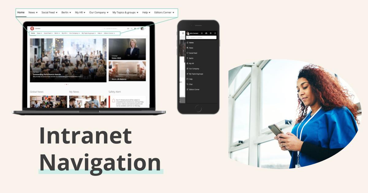
Setting up a whole new intranet portal from scratch or migrating an existing intranet to a new system is a big project. One of the key factors in creating user satisfaction is the structure of your information. Users expect intranet navigation that helps them to find necessary information for daily tasks without any difficulty. They also want easy access—in a logical intranet location—to information that’s not necessarily needed on a day-to-day basis.
So what is information architecture?
Information architecture describes the process of structuring a certain range of information. It also describes how different users retrieve that information.
Elements of intelligent intranet navigation include:
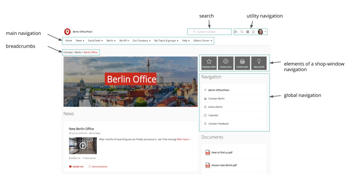
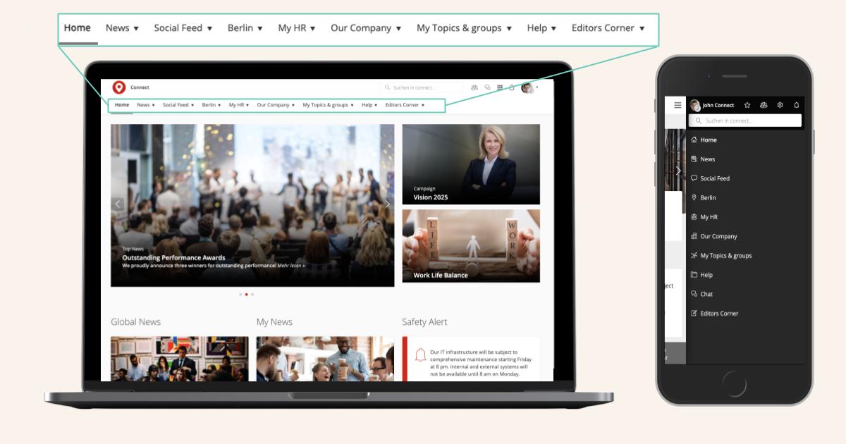
- Horizontal navigation from a main menu or global navigation (most often referred to as top-level navigation or a fly-out menu).
- Local navigation for second- or third-level elements; can also be navigation on a page.
- Quick links navigation bar for mobile devices.
- Utility navigation with the most important links to service elements such as settings, user profile, or bookmarks.
- Dynamic navigation elements that show the most-viewed content or that highlight content based on the user groups or subscriptions.
- Shop-window navigation, including elements such as links or buttons on pages.
- Breadcrumbs that show the path to the page.
The amount of available elements shows the many opportunities of guiding users through the intranet and supplying them with needed information and content. Such a large extent of possibilities can also create difficulties.
To help you avoid problems, we’ve collected 11 best practices and tips that will help you create great information structure.
Navigation problems in the Social Intranet: An Overview
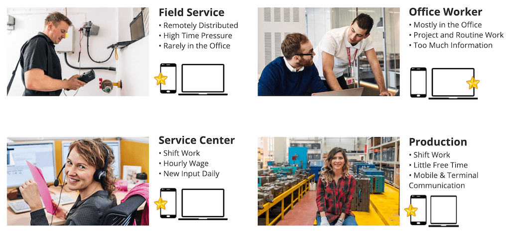
An intuitive information architecture is very important, especially with regard to your different user groups (from office staff to production employees).
Existing social intranets often have no real navigation, with users having to compile content by searching and proactively subscribing. But many employees don't have the time to search for content. They need orientation in their intranet. Therefore, intranet navigation for specific target groups is essential for a true Employee Experience Intranet.
1. As-is analysis and status quo
Before you start creating an information structure, or even re-structuring an existing one, we suggest you analyze the system(s) you currently use.
Important things to look for are:
- What content can be found in the current intranet?
- Is content targeted to specific user groups, or do all users see the same information and content?
Next, an examination of the statistics of the current systems will also provide valuable insights into their usage.
- How often is content accessed?
- What are the top-ranking elements?
- Which content is read infrequently, even though it might be very important to daily business (i.e. work safety documents)?
- Which tools and third-party applications have access through the intranet?
After analyzing the current situation, the project team will have insights about the current intranet content, its usage, and its importance for employees.
2. Get to know your user!
Who currently uses your intranet?
Are only white-collar workers allowed to use the system, or are blue-collar workers also granted access?
When improving an existing information architecture, or when setting up a new one, you should definitely keep such questions in mind. It’s crucial that you know your user, their specific needs, and what they expect from the new system.
Questionnaires or interviews are your weapon of choice for gathering answers to those questions. Working with personas can also provide assistance when it comes to users and their needs.
Personas describe different user groups and their most important characteristics, as well as their needs and interests. This allows you to understand how you can create value in your intranet and satisfy your users’ needs.
At Staffbase we use a persona-based approach to identify employee groups and their specific needs. This works extremely well in giving admins an insight into the minds of their employees groups and helps when creating a targeted structure and content. With systems like Staffbase targeting is not only limited to news but also to content, as well as navigation elements like the horizontal navigation or a mobile quick links navigation bar (similar to a tab bar).
3. Do we still need this?
Does it spark joy or should we toss it?
Minimalism is a direction many people are heading.
But despite what the infamous tidying-up expert Marie Condo might preach, you shouldn't decide on content value based on the question of whether or not it sparks joy.
Nevertheless, keeping some elements in mind while cleaning out your intranet content can prove to be useful.
Taking into consideration the results of the as-is analysis and the user interviews or questionnaires, it makes sense to check whether certain content is necessary. The following questions can help you figure that out:
- Who is reading this content?
- Who is making sure the content is up-to-date?
- Is this content still relevant and topical?
Our experience shows that it’s helpful to consolidate content and to make sure that there are no duplicate pages. Consolidation will help you aggregate content regarding certain topics on one page instead of many, making it searchable and easier to locate for your users. On average, our customers are able to reduce the amount of pages by approximately 60-80%. One international company, that launched their intranet based on Staffbase, was able to cut down around 900 pages to 250. By also targeting the content specifically to different user groups they were able to lower the complexity even more.
As an example: When necessary, a single responsible employee should update pages that aim to inform users about a location and its characteristics. Such pages belong somewhere that’s easily accessible. If necessary, link this information instead of copying it onto another page.
After a proper spring-clean of the system, the structure will be more clear and easier to move to another intranet navigation structure.
Keep in mind the motto, “As much as needed, as little as possible” instead of the commonly used, “More is more.”
4. A Decision with Consequences: Flat vs. Deep Hierarchy
You should structure the information architecture of an intranet in different ways. The polar opposites are flat and deep hierarchies. Many top-level categories and few sub-levels characterize the flat hierarchy. The deep hierarchy has few top-level categories but many sub-levels.
Your intranet project team has to decide whether it makes sense to have many top-level elements in the intranet navigation with few sub-levels, or rather fewer, more generic elements with more sub-levels.
Both options have their pros and cons. With a flat hierarchy, content is easy to discover but more likely to overlap categories, making the structure appear cluttered. In contrast, a deep hierarchy is less cluttered and more structured, but makes it a little more difficult to discover content at first glance.
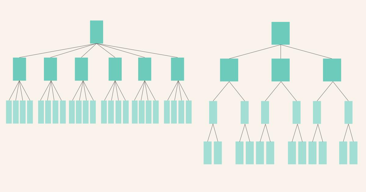
We suggest choosing a happy medium between both options. In this case, you have to be sure that you choose top-level navigation elements that are generic enough to allow content to be easily sorted. But they shouldn't be so generic that content from different categories can be mistakenly sorted (i.e., top-level navigation elements titled “HR, Admin, and Marketing”).
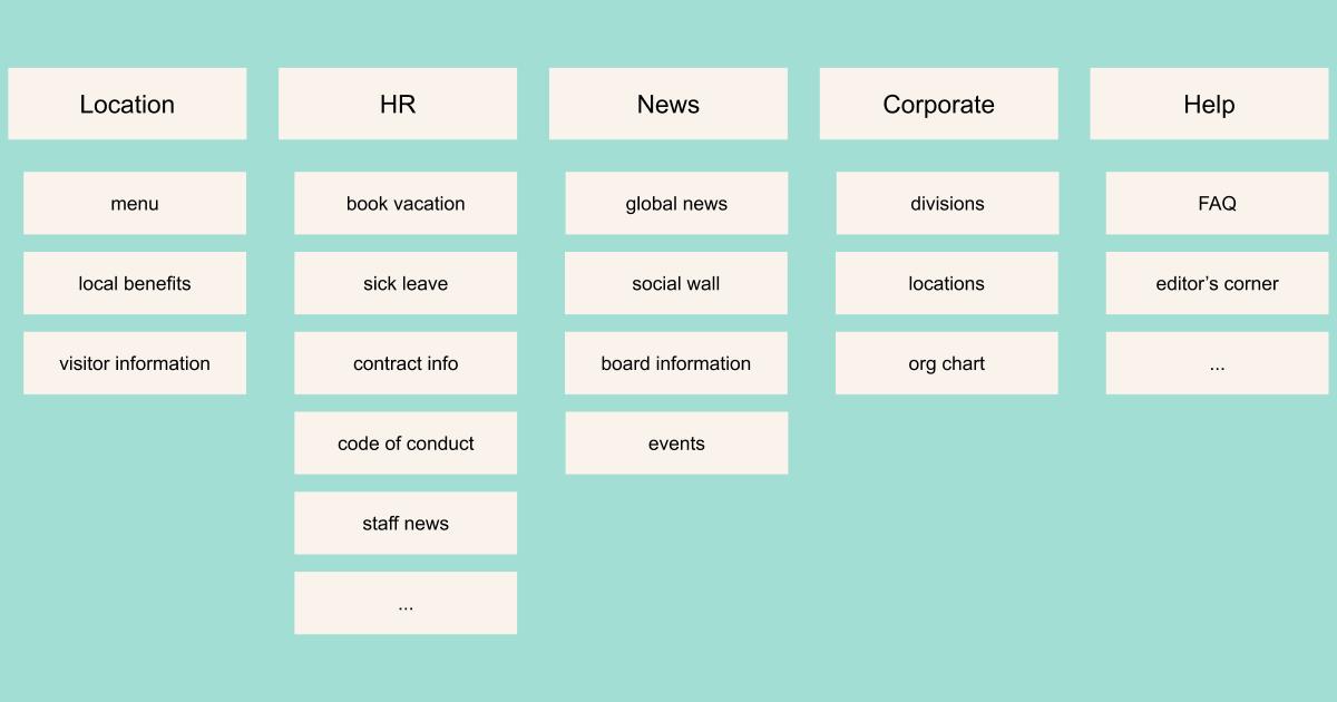
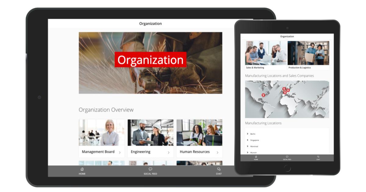
Top-level navigation topics include: News, Our Company, Location Information, Admin, and HR topics—as well as Help and Support.
The deciding factors in this decision are the exact content you’re looking to categorize, as well as the organizational structure of your company.
5. Structure is the key
Structure is the cornerstone of your intranet. That's why you should tackle it early in your project. The first decision to make is on how your intranet navigation should be structured.
Should you structure top-level navigation by topic or by organizational structure?
One option is to align the navigation with the structure of your organization. This is easy and intuitive to set up, especially for your editorial team. You can simply present content in the navigational structure of the team that created it.
This type of structure creates problems when the organizational structure or the responsibilities of creating and curating content change. Another point of criticism is that this type of structure isn't very user friendly. To find content, users have to know exactly which department or team they belong to. This can be exceptionally problematic for big companies or firms with many departments.
Taking this into consideration, we suggest you structure content by task or topic. This way, the content an employee needs to perform exceptionally well each day is the basis of your structure. Not every user needs all information from every department available at a glance. By personalizing the content a user sees and targeting news and tools, navigation will be easy for each user.
6. Get it sorted!
After points four and five have provided insight and food for thought, you’ll want to start matching content to suitable categories for your top-level intranet navigation. Useful tools to support this process include card sorting and tree testing.
Card Sorting is a method to cluster content into various categories for your top-level navigation. Options are an open or closed card sorting. Open card sorting allows participants to cluster content into topics and to name the categories.
When doing closed card sorting, participants have to match content to predefined categories. We suggest that attendees work alone so you can use their data to check which matching has the most “votes” afterwards. Once you have created a first draft of the structure, it’s helpful to test it and make adjustments if needed. If you would like to learn more about the different types of card sorting and its benefits, the article by Justinmind and usability.gov could be helpful to you.
One way to test whether your developed navigation structure is plausible and usable for employees is to conduct tree testing. This method aims to check whether users can find content and how long it takes to find it. A user must locate a certain piece of content, with his or her click-path recorded. This method is especially helpful when you’re trying to find opportunities to improve your information architecture. If you are looking to deep-dive into this topic, consider having a look into the articles provided by the Nielsen Norman Group.
Most of our customers have found it incredibly helpful to use card-sorting techniques in order to identify possible content clusters. It is especially handy when big project teams are involved and where it is otherwise hard to match content to categories.
Through our many successful intranet projects we have come to the conclusion that it makes sense to have no more than nine top-level elements. Increasing the number of elements clutters the navigation again and makes it hard for employees to find content (see points 4 and 5).
7. Don’t beat around the bush!
MyHR, HR, Human Resources, or myStaffbase?
There are a thousand-and-one possibilities for naming your top-level intranet navigation elements. In other words, there's no universally standardized structure for it and its naming.
The following hints have proven very useful when trying to decide on naming:
- Short and sweet
Categories and titles should provide a short and concise summary of the content that users will find there. - Find a personal connection!
The intranet should connect every employee. But your users may have to learn that their interaction with the intranet is desired. Titles like MyLocation or myCompany might help to reduce inhibition and create a personal connection where previously there was none. - Consider your user
Only use words and titles that your employees know. If they know that PX includes all information on human resources and hiring, this should be your title. If your users don’t know what to expect from a certain title, find something else.
While you are on the topic of naming we suggest that you make sure that not only your menu item title creates a personal connection to your employee (i.e. myHR) but also the content. Targeting the content plays a crucial role in reducing complexity for your users as they only see content that is relevant to them as it is personalized to their needs and interests. One of our trailblazing intranet customers Heraeus created incredible value for their employees by doing that.
8. Relevance and Priority
Horizontal intranet navigation plays a big role in any intranet. It is the central entry point for accessing various content and tools.
What you should do:
- Investigate which menu items play a crucial role in your employees' daily work.
- Organize your items by their importance to your users.
- Visually differentiate between different levels in your navigation. A first-level menu item should have a bigger size or be highlighted with a different color.
What you shouldn’t do:
- Don't organize your menu items solely based on their importance in the company. The intranet is one of the most important sources of information for employees. It should consider its users as the main stakeholders.
9. Intranet navigation aside from the horizontal navigation
As noted, intranet navigation doesn’t solely consist of the top-level navigation or menu. Other elements for navigating an intranet include utility navigation, on-page navigation, search, and breadcrumbs. They play a crucial role in allowing the user hassle-free access to pages, tools, and apps.
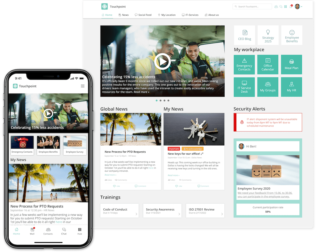
Breadcrumbs are a traditional intranet feature, and they remain important. They show the user where they currently are and allow for easy navigation to different levels without the need to navigate back and forth with the arrows in the browser or on mobile.
Utility-navigation:
This element for navigating includes the following elements:
- Settings and user profile: This includes notification settings or the app language. Furthermore, users can edit their profile here.
- Bookmarks: Bookmarks and favorites can be important for users because they are personalized and allow fast location of content that’s important to them.
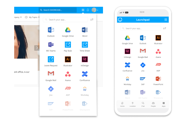
- Launchpad: Features such as a launchpad give users the possibility of jumping from the intranet into other third-party systems and apps. The order of the elements in a launchpad is determined by the user’s behavior. Frequently used elements are shown higher up than rarely used ones.
- Other elements: Other functionalities of utility navigation include sharing of content and translation options for content and pages.
On-page navigation:
There are various options to support navigation on a page.
These include:
- Links and buttons to forward the user to other content in the intranet or third-party systems.
- Anchor links, to allow easy navigation on content-rich pages. They are also an easy way to give the user an overview of the content elements.
- Dynamic on-page navigation: Some systems (i.e. the Staffbase Employee Experience Intranet) allow for the display of section navigation on a page. This enables the user to jump from one topic page to another without having to use horizontal navigation or breadcrumbs.
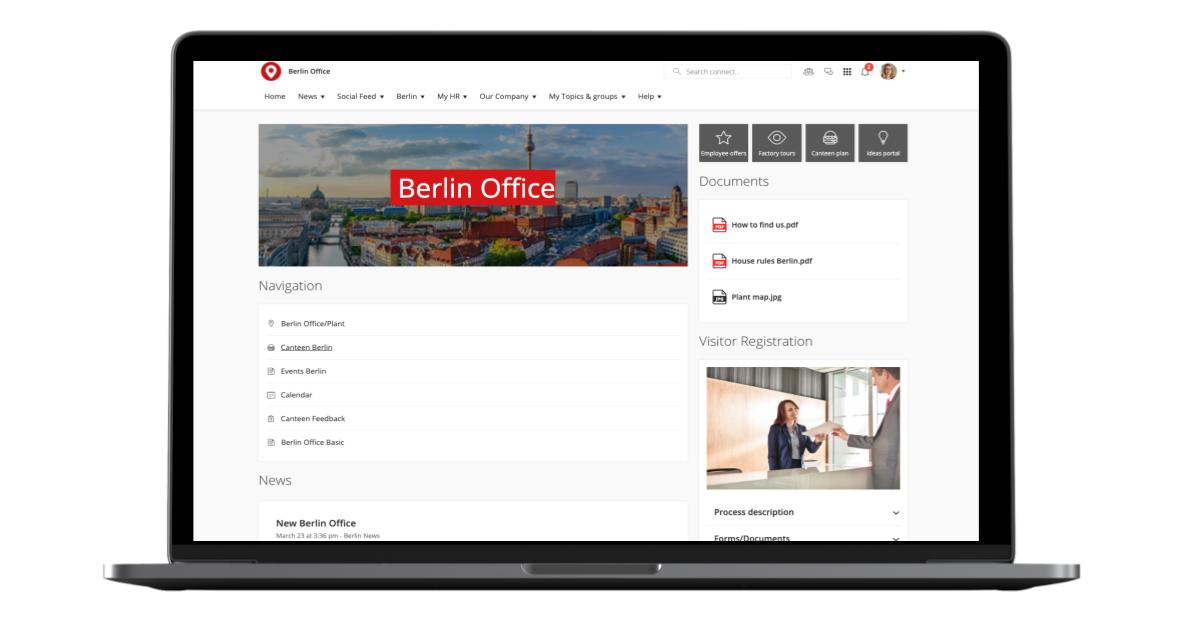
Search: This intranet navigation element is often forgotten. But it plays an important role in making content that’s not displayed in the horizontal navigation accessible to users. One scenario where search is important occurs when a user visiting another office location wants location-specific information that's usually only shown to employees working at that specific site, such as available parking spots, operating hours, or the cafeteria menu. .
10. Why landing pages will not solve all your problems
A commonly used tool to help users find information regarding different topics are landing pages. They are Most often a collection of links to pages on different sub-topics.
Landing pages can be useful in drastically reducing the amount of elements in horizontal intranet navigation or menu. And with only a few clicks they can make content available to users .
What tends to be forgotten when creating landing pages is that every page in the intranet should be more than just a collection of links. Landing pages should ideally provide real content. A bunch of links to sub-topics on human resource matters doesn’t provide value to users.
The different sub-pages could be displayed in the menu and the user would need fewer clicks to access them.
Another issue with landing pages is that content that’s linked there often isn’t accessible through search. That's why they should be used rarely and wisely.
What you should not do:
- Create too many landing pages that just consist of links.
What you should do instead:
- Create landing pages that provide an overview of certain topics—like corporate functions—and provide users with valuable information. While linking to the different pages you can provide brief descriptions of the topics, as well as a central contact point for questions.
11. Why the 3-click rule is not all that matters
When drafting an information architecture, admins are usually told to follow the infamous 3-click rule. It states that users will abort their search for information if they don't find what they’re looking for in three clicks of less. A big issue with this rule is that it lacks scientific foundation and proof (Laubheimer 2019).
Findings in fact show that users don’t end their quest for information if their three first clicks have been unsuccessful (Porter 2003). Whether fewer clicks lead to greater satisfaction has also been tested. This isn't the case. Fewer clicks do not automatically result in more satisfied users.
The 3-click-rule isn’t a poor assumption. But one should instead focus on whether the user can find information within a few clicks rather than insisting it must always be three or less. Doing so could create extremely wide or exceptionally flat hierarchies. As already stated above, neither of these polar opposites are particularly user friendly.
Conclusion
Building an intuitive information architecture or optimizing an existing one isn't a trivial task. It is in fact highly complex. But with the use of certain tools, best practices, and techniques, you'll be able to find a solution that best suits the needs of your users. When implementing an intranet solution based on Staffbase, our consultants will support you with their expertise. Furthermore experienced partners are also available to guide you through processes like card-sorting and tree testing as well as the identification of personas.
