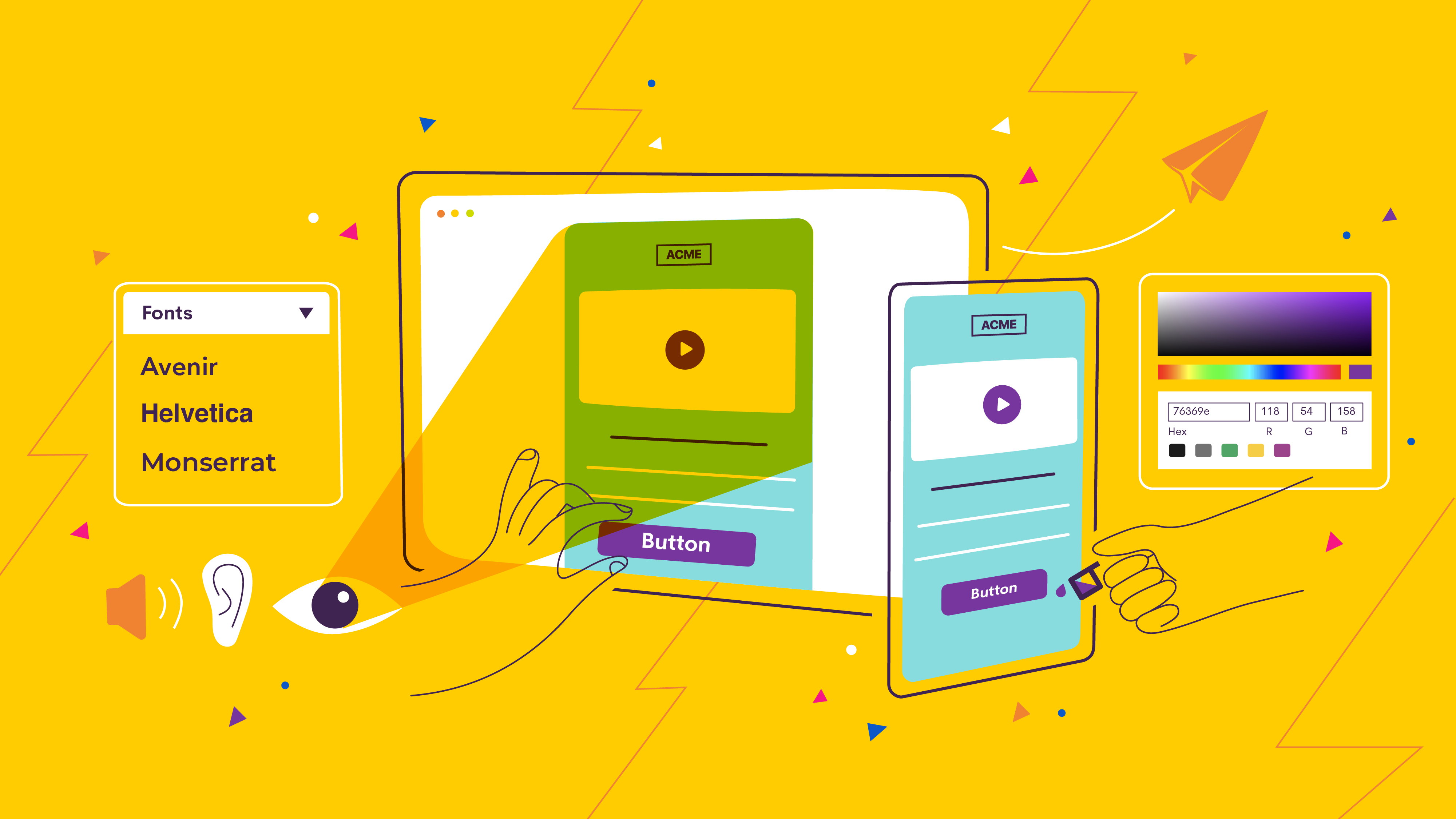
You know there’s a lot more to creating a good employee email design than just ‘making it pretty.’
But the stakes are higher than you may think.
Good design is crucial to communication. Without it, you risk clouding your messages or creating cognitive barriers to accessing important information.
Visuals influence human comprehension and decision-making more than any other factor. And many studies have confirmed that attractive designs work better to convey complex ideas, influence cognition and decision-making, and improve usability.
So if you are neglecting your internal email designs, you could be clouding your messaging and creating obstacles to clear and effective communication.
I know what you’re thinking:
But I’m not a designer.
I don’t have time.
I don’t have the tools.
I wouldn’t even know where to start.
Well, have no fear.
We’re huge internal email design nerds. And we're going to give you a crash course in email design, so you can be confident that the emails you send are beautiful and engaging.
And when you master these internal email design best practices, not only will your email designs look better and get your message across more clearly, but you’ll be able to apply them to all of your other communication channels as well.
Table of Contents
Internal email fonts best practices
The best font choice is the one that readers won’t notice.
If your reader is busy thinking about your font choice, how hard it is to read, or how unique it looks, it is already taking away from your message.
And the fastest way to get someone to stop reading your email is to choose a weird font. Think Comic Sans:
Or Papyrus:
As much *fun* as you may think they are, they are difficult to read and lack professionalism. And they scream outdated design.
Reserve these fonts for your yard sale signs or your kids' school projects about Egypt.
Font basics
To get a better sense of which fonts are appropriate for internal emails and which will pair well, first you need to know the difference between serif fonts and sans serif fonts.
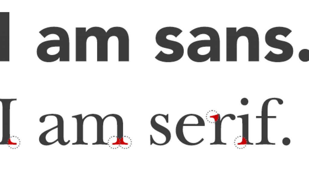
A serif is a small line attached to the end of a line in a letter. A font without these little lines is sans serif (which literally translates 'without serif').
Serif fonts often look more traditional and sans serif fonts tend to look more modern.
Canva advises using a sans serif font in your heading and a serif font for your regular text. This is because serif fonts are generally easier to read. They make individual letters more distinct and our brains recognize and process them faster.
But Urban Fonts claims that you should primarily stick to sans serif fonts on the web, including emails. Printed works have 100x the resolution than the average digital screen has, which means serif fonts could be harder to read because they don't appear as clearly. The extra lines end up looking muddy.
Sans serif fonts are therefore your best choice for the body text of your email and will ensure your text is easy to read on any screen.

Readability best practices
People need to be able to read your font for it to be effective.
Go for simple and conventional--novelty is not your friend when it comes to legibility. Again, if people are thinking about your font choice, you’re doing it wrong.
Look for spacing between the letters--fonts that smush letters together take longer for your brain to untangle and recognize.
Pro tip: The professional term for adjusting the space between a pair of letters is called ‘kerning�’.
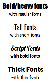
Complementary internal email fonts
When pairing different fonts, you have to pick fonts that are complementary. Your email will be hard to read or unprofessional looking if your fonts are too similar or clash. Your fonts should be able to coexist without being distracting.
But there are so many fonts to choose from!
Don’t worry, you don’t have to memorize every font type and its pair. Just keep these popular combinations in mind:
You don't need to re-invent the wheel either. Here’s another list of font pairings that always look good.
Best font size for internal emails
Any font choice can go astray if your sizing is off. If your font size is too small, people won’t be able to read it. If your font is too big, it will look weird and make the email super long, especially on mobile devices.
It�’s also important to have a noticeable size difference between your header font and your body font to ensure a good hierarchical flow.
Generally, a good header should be between 22-28 px, and body text should be between 14-18 px. Some fonts will still display as different sizes, even if their size in pixels is the same, so use your judgment and make sure it is readable.
Line height is also important to consider so you can avoid overcrowding your text. A good practice is to adjust your line height to around 1.4-1.5 times more than your font size.
Custom brand fonts
Many organizations have developed their own fonts to use across their brands.
In order to use these custom fonts in your emails, your recipients must have them installed on their machines. This may already be the case, but the fastest way to confirm this is likely to check with your IT or system admin team.
If you want to use a custom font in just a few places in an email, like in the heading of your newsletter, a low-tech solution is to create the heading with something like Adobe Photoshop or Canva, save it as an image, and upload it as an image into your email design.
(Note: We recommend only using this method for headings or titles and never for paragraphs or other longer amounts of text.)
If you use images in the place of text, make sure to specify alt text so that recipients who rely on screen readers will still be able to hear the text that is contained in the image.
Whether you’re using a free, licensed, or corporate font, make sure that you understand the font’s license.
Internal email colors best practices
If only it were as simple as picking some colors you like and throwing them together.
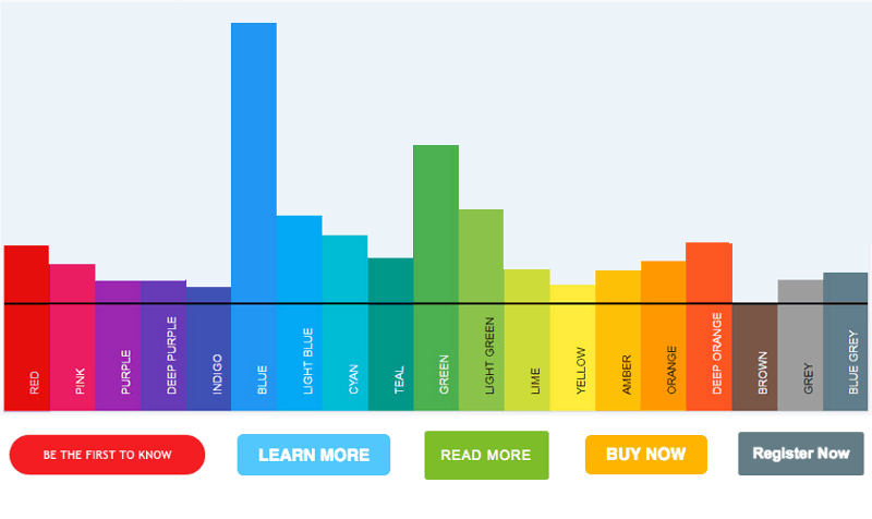
Colors are too important to pick randomly. They increase brand recognition, elicit meaning, spark emotions, and carry associations.
For example:
Youthful and optimistic
Urgent and Energetic
Trustworthy and Secure
Relaxing and natural
Friendly and cheerful
Sentimental and feminine
Powerful and sophisticated
Calming and beautiful
Balanced and simple
But that doesn’t mean your email should use all the colors of the rainbow without discretion. Using too many colors will make your emails hard to read and will look unprofessional.
It’s important that the colors you are using in your email reflect the tone of your content. When done right, your color choices should reinforce the mood you are trying to set.
Email background colors
Some designers choose just one background color and use it consistently. Others use color to signify changes in sections or content. Either way, you have to make sure the color isn’t overpowering.
Think about the feeling you want to evoke. A lighter brand color or shade works best if you are planning on a single color for the background, while more vibrant colors help break up content in an email.
But remember: just like your font, the background isn’t the focus of the email. Make sure your color choice is readable and not distracting.
Text colors
Most text in your emails is probably black. And that’s not a bad thing. Most of the time, simplicity is best. Black—or a darker color on a light background— is the most readable way to present text.
But, if you’re feeling brave and want some eye-catching color, you can experiment by putting headings and subheadings into different complementary colors.
For more on using brand colors, jump to our internal email branding section.
Buttons or calls to action
It’s also generally accepted best practice to put your links or calls-to-action (ie. buttons) in contrasting colors to your body text, in order to draw the reader’s attention.
You want calls-to-action to pop in your email. They are the only element of your email that should be distracting.
Another fun way to use color in your email body is to switch up the usual blue link color with another color from your brand or chosen palate. This will make links stand out and can look really sharp.
Choosing complementary colors
If you’re using photos or images in your email, you can try complementing the photos by reflecting their colors in your headers and call-to-actions. This will give you a consistent aesthetic.
Or you can use the color wheel.
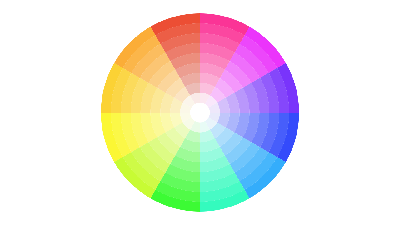
Generally speaking, any two colors that are opposite to each other on the color wheel pair well.
Colors that are next to each other on the wheel usually go well together too (like yellow and purple, or yellow and blue).
And if you’re feeling really ambitious, you can combine three colors that are equidistant from each other for a nice contrast.
Pro tip: Use this awesome website to generate a beautiful color scheme.
Best practices for avoiding information overload in your internal emails
Every element in your design has its own weight. As such, some design elements can throw off a good balance.
A balanced design is important because it creates visual unity and is easier for the brain to comprehend.
If a design is too distracting or hard to look at, it will take longer for your readers to get the message. They may even miss key elements if their eyes get lost in an unbalanced design.
That’s because of cognitive load.
Simply put, cognitive load is the science-y term for the amount of brain power we require to understand new information. Too much cognitive load results in the all-to-common, informational overload.
The human brain only has so much space to process different ideas at once. Ask it to do too much, and the mind will slow down, make more mistakes, or even give up entirely.
Here’s the thing: every little detail you add to your email increases the cognitive load of the reader.
Whether it’s a quick link here, another CTA there, or that perfectly relatable meme, each addition is just one more piece of information that the reader has to process.
An employee newsletter with too much going on causes information overload. And overload means your reader probably won’t read or engage with your email at all.
If it’s too hard to read, employees simply won’t read it.
Your click rates and open rates will plummet.
But perhaps the worst effect of cognitively overloading your reader is the negative impact it can have on how they feel about your newsletter. When your newsletter feels like hard work, employees will be less likely to engage with it.
Creating a balanced, easy-to-digest email design
First, understand how each element in your design is weighted. For example, a large text box with a dark background or a photo carries more weight than a smaller text box with a white background.
Balancing a design often comes down to instinct. What does the design feel like to you?
Does it feel cluttered?
Is there too much going on on the left side of the page?
Are your eyes being drawn to a particular area and skipping over others?
If you are getting a sense that something is off, you’re probably right. Experiment by moving elements around and seeing how they change your perception of the email.
Alignment is also key to creating a balanced, unified design.
(Editor’s Note: If you don’t have the ability to move elements around easily because you’re still working with HTML, you should definitely try out our easy-to-use employee newsletter designer.)
Accessibility best practices for internal email design
Most often, making employee communications accessible means setting design standards for ease of use, taking into account the needs of individuals with visual, hearing, cognitive, or mobility impairments.
But designing for accessibility benefits everyone.
Making your communications accessible helps give everyone the same opportunities and access to information, no matter their ability or circumstance.
And generally, taking accessibility into account when you are designing your communications means that it will be easier to understand and read for everyone, regardless of the devices they are using or the speed of their internet connection.
Here are some things you can do to make your employee emails more accessible for everyone:
1. Choose a minimal, focused design
Make it clear what you want employees to get from the email and draw their attention to that information with your design.
Clutter and visual noise will be hard for anyone to interpret, and is especially challenging for people with visual impairments or people with attention deficit disorders.
2. Make sure the most important information is in the text
Sometimes to make a design pop we might embed text in an image, or write information over a photograph. Though it may look nice, people with visual impairment won't be able to get that information from their screen reader or other accessibility tools.
3. Be smart about your alt text descriptions
Alt text is the text that appears on a page or website if an image doesn't load or can't be displayed.
When people using screen readers open your email, the alt text is what the screen reader picks up in place of the image.
So, if you're using an image, make sure the alt text gives an accurate depiction of what you're displaying in the image or includes the information you are trying to convey through the image.
Example: Instead of using alt text to repeat your caption, write a description of the image like: "Orange on a blue background."
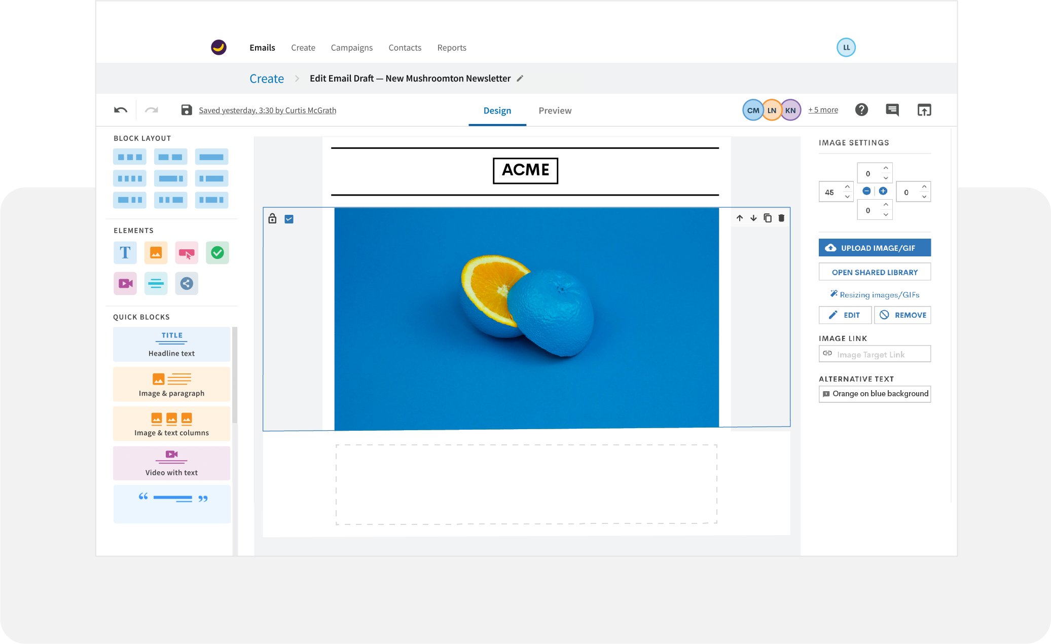
Whatever you do, just make sure you don’t leave the original file name (i.e. image028.jpeg) as the alt text.
4. Put yourself in their shoes
If you can, try to read the email in as many ways as possible:
- Try reading it with a screen reader and listening to the audio version of the email.
- Open it on different devices to see how it displays.
- If you know any people in your organization who have challenges reading the emails as they are currently designed, it doesn't hurt to ask for their feedback.
For more insight into how to build employee emails for accessibility requirements, we’ve got more tips here.
Internal email branding best practices
You’re probably not the only person in your organization who will build and send internal emails.
This means you have to watch out for version control issues… like your colleague using seafoam green or Comic Sans because it’s their “creative vision”
First of all, people love to make a design their own—and, often they don’t know they’re doing anything wrong.
That’s why maintaining brand consistency in your internal emails is so important.
Branding consistency helps you maintain a consistent look and feel across your organization, which promotes good employer branding and increases the trust people place in your communications.
In the era of email scams, big leaks, and hacks, it’s important that employees trust the emails they are receiving from you.
If the branding in your emails is inconsistent, your communications will look unprofessional and confuse employees.
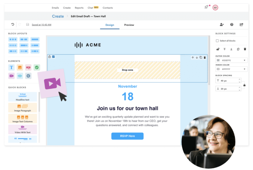
With a tool like Staffbase Email, you can avoid that confusion and create on-brand, professional emails
Starting with Staffbase Email’s pre-built templates or from a blank canvas, you can easily build templates for weekly newsletters, executive messages, important alerts, and any other internal email that is frequently sent in your organization.
Our platform is designed to support all sizes of comms teams within large organizations, so all plans include unlimited users. Once you build the perfect email template, you can choose to save it for your own use or instantly share it with your team or even other departments across your organization.
Want to make sure everyone uses the same color and font?
No problem.
You can save your brand colors and fonts in these templates so that they’re ready-to-use—and even restrict other users from using unauthorized colors and fonts. That way, your teammates won’t go rogue with their own designs, and you can make sure your readers can focus on the meat of the email: the messaging.
Having a tool that allows you to save and lock your branding settings across an organization is going to save you tons of time.
Not only will it streamline your email creation workflow, but it will also allow you to share email creation responsibilities with other teams and departments, without worrying that they’ll send something off-brand or unprofessional.
Mobile-friendly internal email design best practices
You need to consider how your newsletter will be consumed by non-desk or remote workers. If they can’t read it, you’re depriving them of one of your key comms channels.
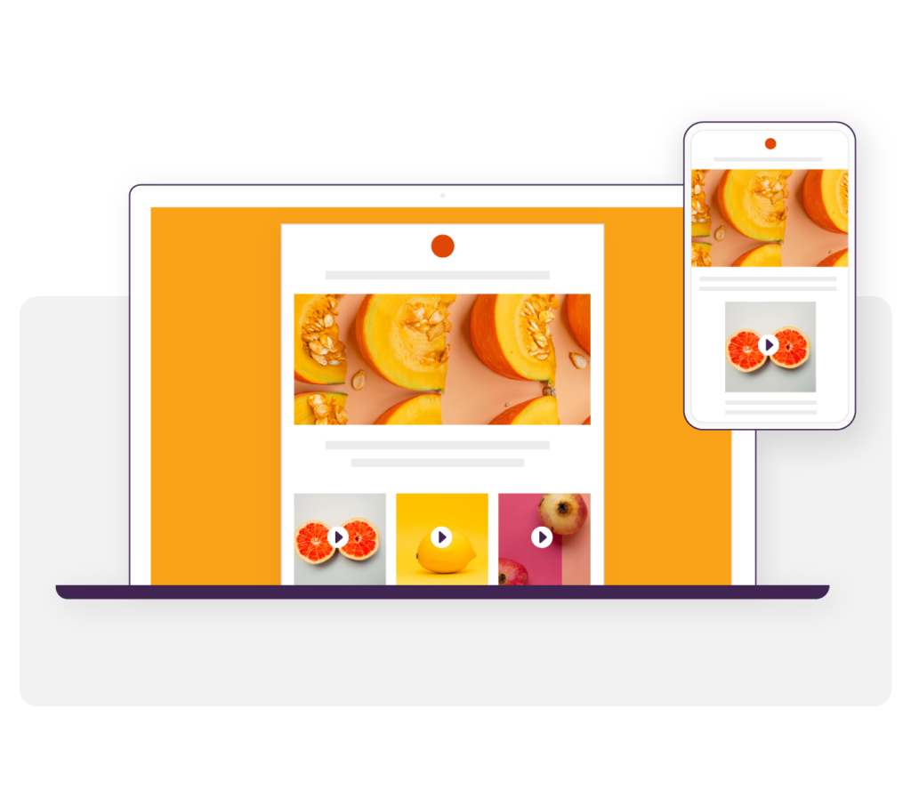
Designing for mobile or various screen sizes is often referred to as responsive email design.
Responsive email design means that an email will respond to the device it’s viewed on, rather than just showing a smaller version of the desktop email. Responsive design usually includes elements like columns that stack on top of each other in the email and fonts and images that automatically resize to fit the screen.
If you use a platform like Staffbase Email, your employee email design will always be responsive, even when you send from Outlook.
If you’re not using an employee comms tool like ours, there are still steps you can take to create more mobile-friendly designs.
For example:
- Simplify your layout
- Ensure anything that’s clickable is large enough to touch with your finger on a mobile device
- Consider your image sizes. If people are receiving on mobile, you don’t want super high-resolution images that will take ages to download and use up all their mobile data.
Test drive the best employee email designer in the biz
Don’t have the time or expertise to design your newsletter from scratch?
We've got you.
Our employee newsletter designer is easy-to-use and super intuitive.
Using our simple drag-and-drop interface, it’s possible to create stylish and effective internal comms emails—even if you have no design experience.
Every Staffbase Email account is equipped with professionally designed, modern, fully-customizable employee email templates that you can adapt and use immediately.
Plus, each template in our employee newsletter designer is fully responsive. That means whether employees are reading your emails on desktop, mobile, or anything in-between, your email designs won’t break and will always look professional.
On top of all of this, you can say goodbye to version control issues. With Staffbase Email, you no longer have to go back and forth—you can collaborate with your colleagues in real-time on the same email.
Intrigued?
Go and book a free demo with our team today.